Mobile-first navigation for core account screens
Project overview:
Designing a simple navigation pattern to improve usability and increase discoverability by 24%.
Wise is an international account used by 16 million people. I designed a new navigation pattern to scale with our expanding account offering and support product growth, as well as making the product easier to use, and easier to design for.
The problem:
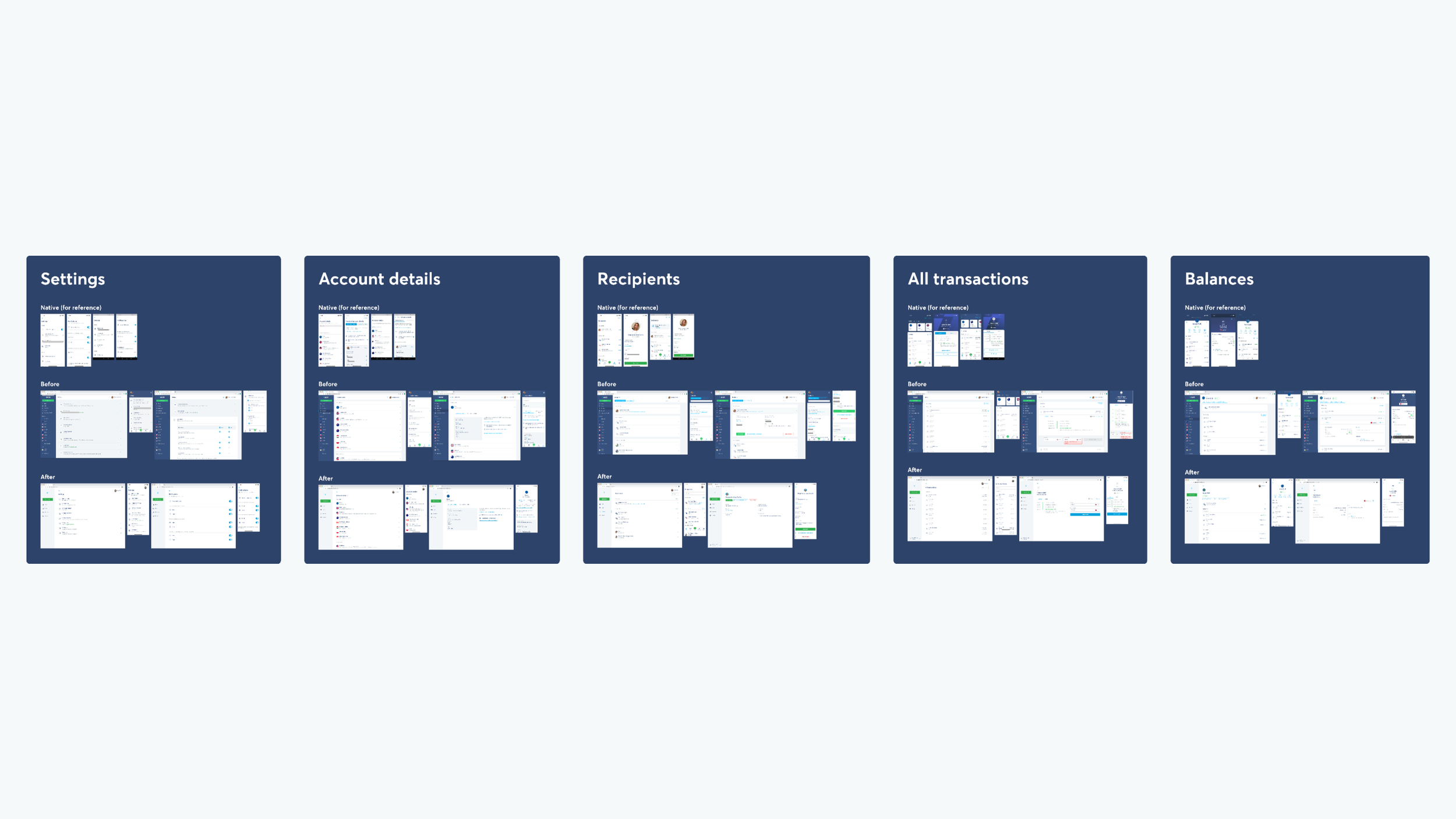
The mobile web and desktop had a different structure to iOS and Android, causing problems for users and the business.
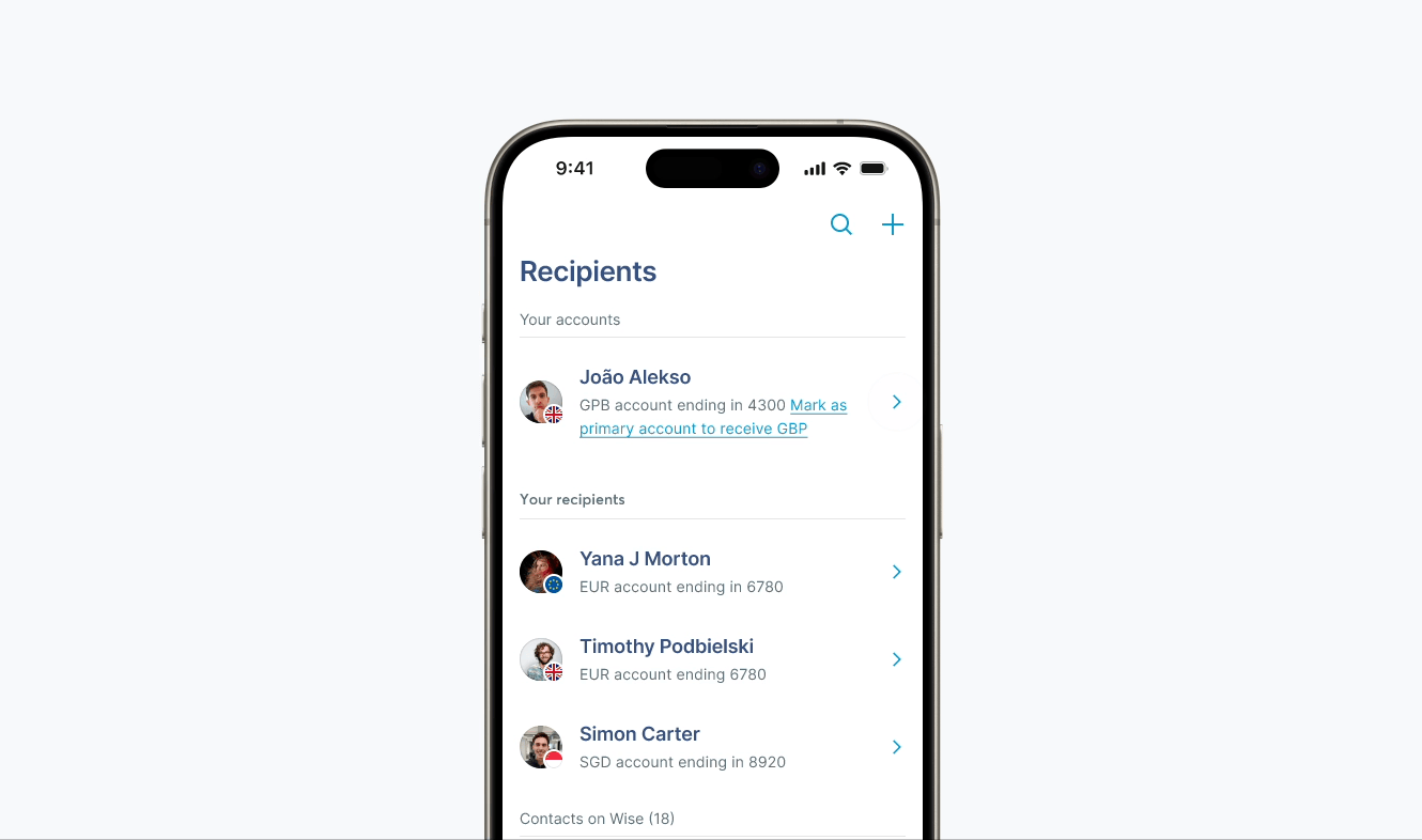
On Android and iOS, we nested views so users always had focus. But mobile web and desktop relied on unwieldy lists of expanding cards.
Key features were hidden deep within collapsed cards, hampering adoption
Cards all looked and behaved differently, giving users an unpredictable experience
Content wasn’t scrolling to view
Designers were getting stuck translating mobile designs to web.
The users:
Designing for end users and internal users
People and businesses managing their Wise accounts on web or mobile.
Designers and engineers building multi-platform account experiences.
The team:
Cross-team collaboration was critical
Product Designer — Stephanie Smith (me)
Tech Lead — Helen Durrant
Engineering — The Web Guild (engineers from teams across Wise.)
Collaboration — Core account product teams
Discovery research:
Defining the problems and building empathy.
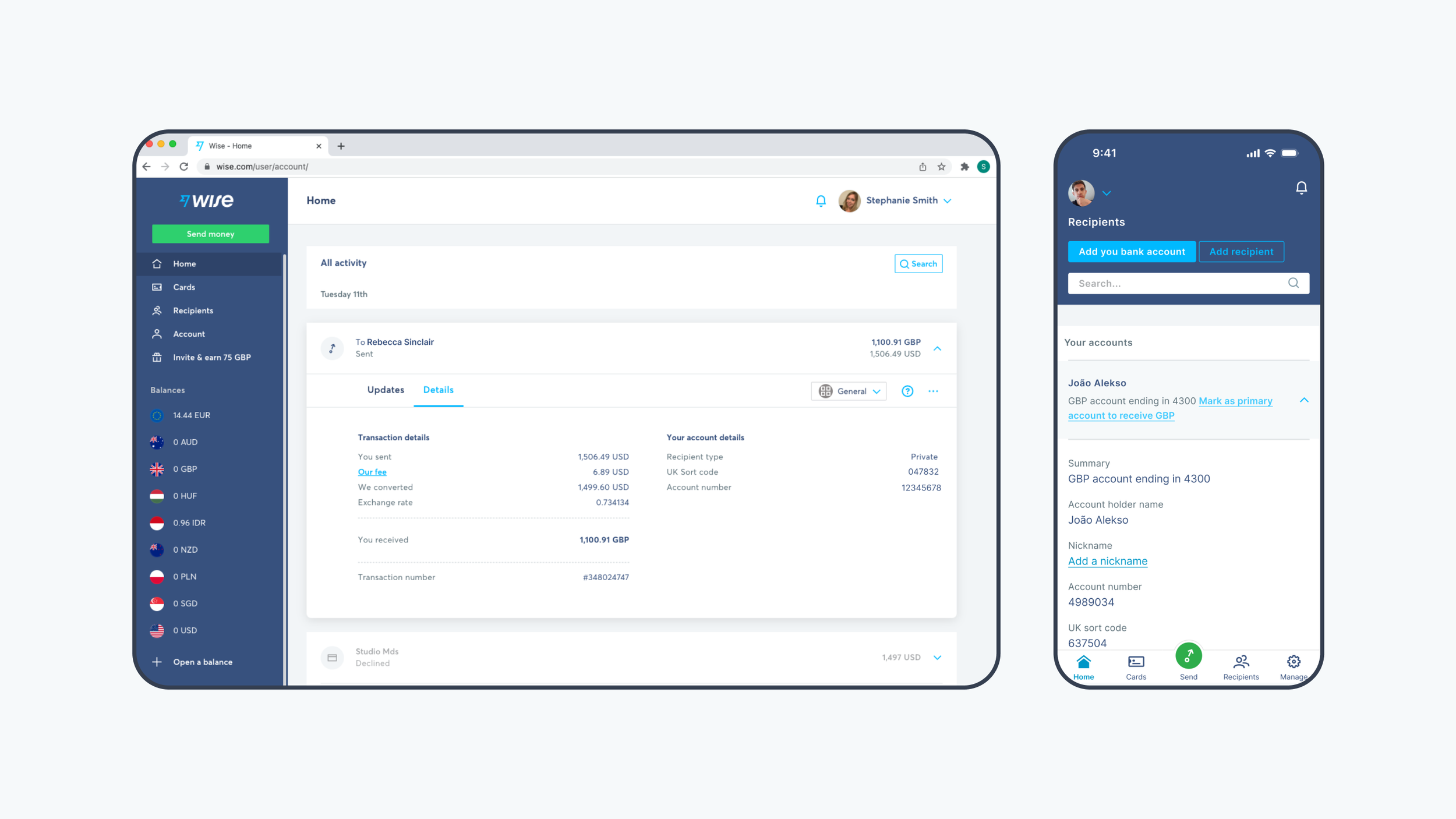
I started by auditing the product on Android, iOS, mobile web, and desktop. Comparing the experience across platforms enabled me to identify usability issues and define the problem.
I also interviewed internal design systems users (product designers and engineers) to understand their pain points, build empathy, and gather qualitative insights to measure impact against.

To get inspiration, I also researched navigation pattern best practices by reviewing Apple’s Human Interface Guidelines, and Google’s Material design system, as well as gathering examples from other products.

Design explorations:
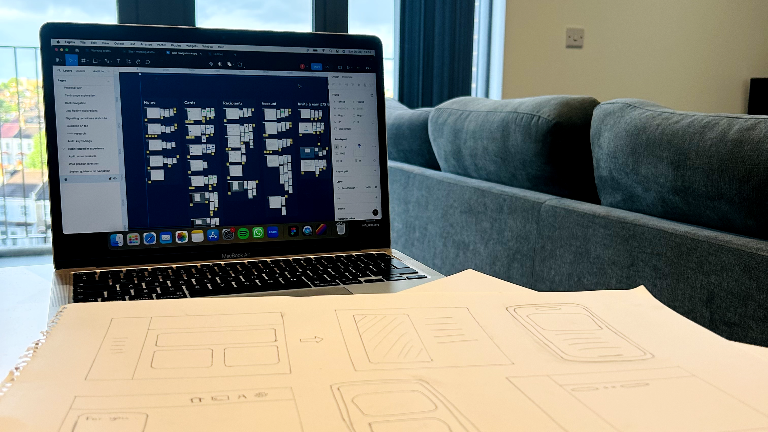
Sketching a wide range of ideas
I created low fidelity sketches of lots of different navigation patterns to start generating ideas — including bigger structural changes to desktop navigation and mobile layouts.
Refining the solution:
Narrowing scope due to tech constraints
This was a complex technical and cross-team change. I had to reduce scope to ship fast, so we ruled out more complex layout changes for the time being.
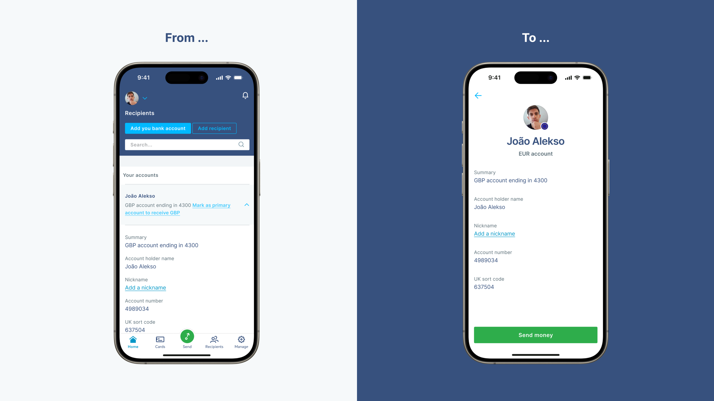
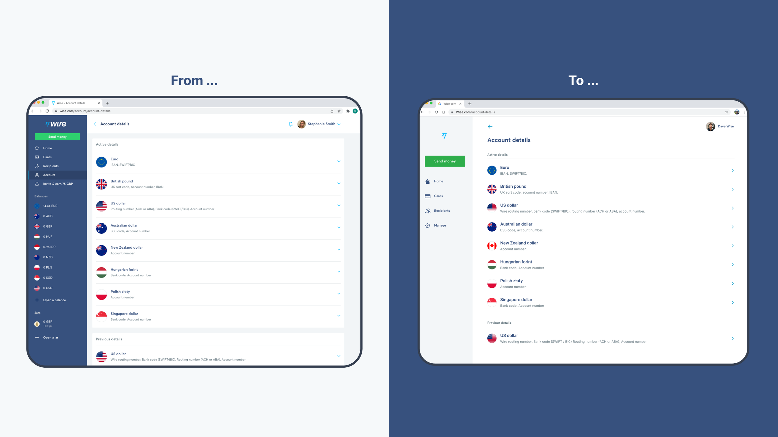
The simplest solution was to replace the expanding cards with our navigation option component, and navigate users to sub-level screens, just like native mobile.

I added a back arrow to the tool bar in sub-level screens so users can navigate back, and decluttered the UI by moving the screen title and actions out of the top tool bar, removing the keyline, and increasing the padding.
Data & testing:
Using data and testing in product
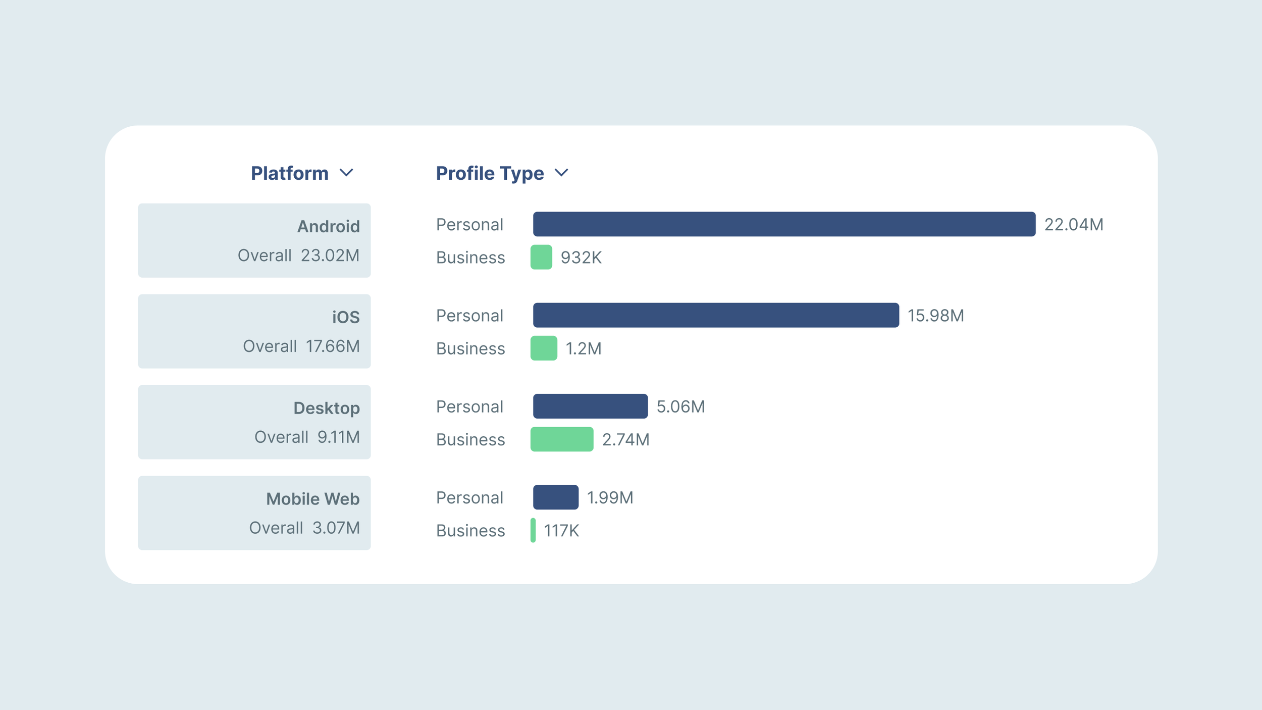
Bringing this pattern to mobile and desktop web was extremely low risk as it already existed on our native mobile apps. Data from the past 30 days confirmed that users had successfully navigated the product using this pattern on iOS and Android over 38 million times.
We used this data to give product teams confidence to adopt the new pattern on mobile web and desktop. Working with core account teams, we agreed to trial it in one area of product first. The results were encouraging, so we then rolled it out to 100% of users.

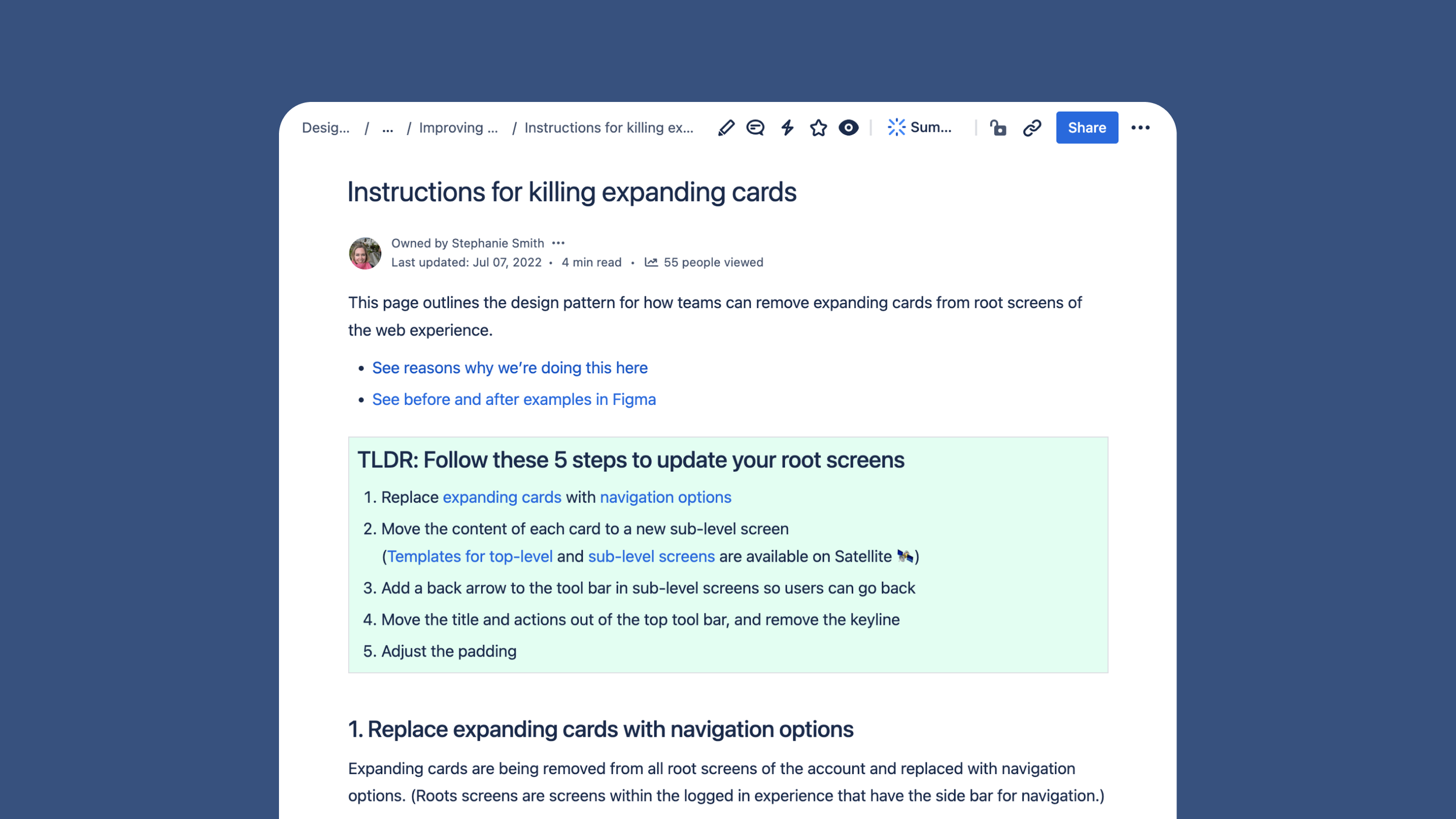
Supporting the build:
Co-designing a wider roll-out plan to galvanise teams
I collaborated with tech lead, Helen Durrant, to support product teams as they migrated to the new pattern. We updated core components, created instructions for engineers, and co-presented in squad demos and guild meetings.
I also shared a set of before and after examples screens with teams to help them visualise the changes.
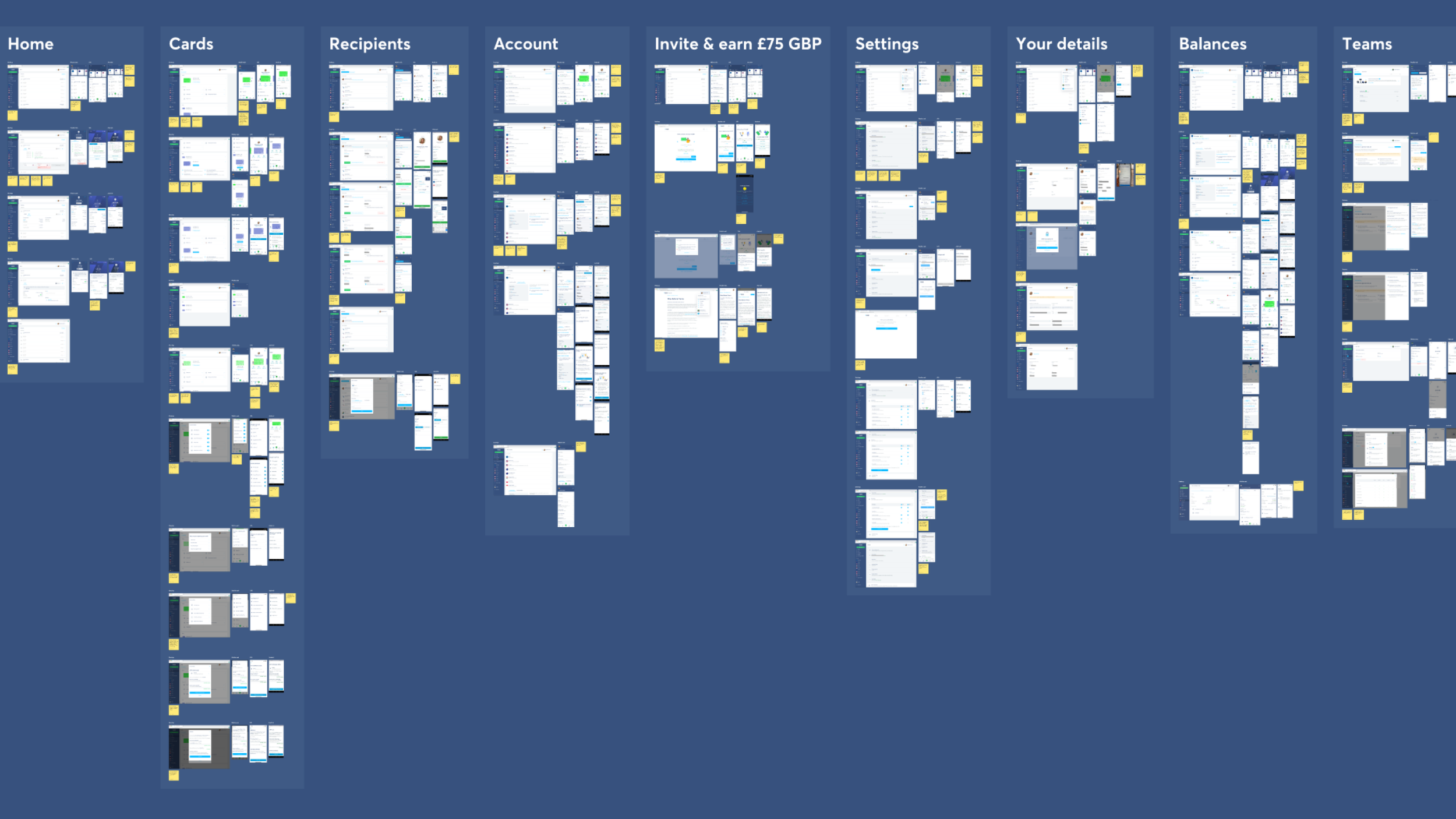
And I updated our account screen layout templates within the design system Figma library to help product designers adopt the new pattern.

Results
Teams reported a 24% increase in users adopting features that were previously hidden within cards
We levelled up quality by fixing usability issues and providing predictable interaction patterns.
Internal teams shared positive feedback and queries on how to convert mobile designs to web stopped completely.
We decluttered the UI, laying a solid foundation for the visual changes of an upcoming rebrand.